Facebook home page for mobile: success or disaster?

Many of you out there may or may not be aware that Facebook home for mobile has been released. I was actually pretty excited for this since android doesn’t always get the love it should. (Yes, I’m still upset about Twitter not releasing the Vine app for android!) Now that Facebook has shown support for android, at least certain newer models, I wanted to give it a fair shake.
The images are SLICK, I mean slick. The problem is that other than seeing pretty images across my screen continually, the functionality isn’t there.

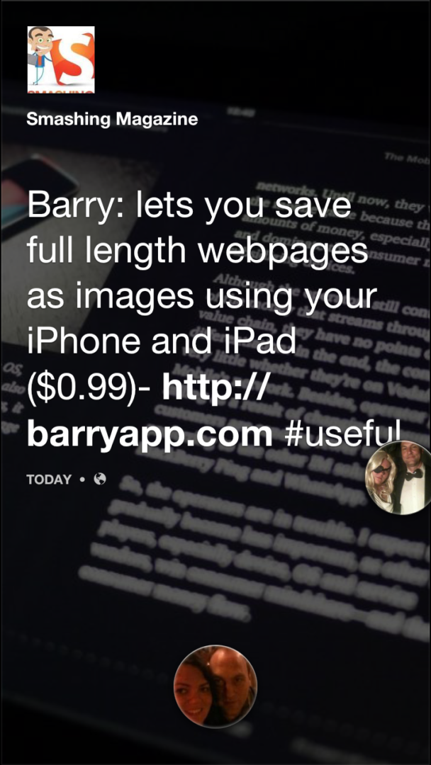
Screenshot of FB home from my phone
One of the bubbles here is me, the other is my husband. This is from his account, so it’s showing him a bubble of me for following Smashing Magazine. This would be far less confusing if we both didn’t have both of us as a couple in our profile photos! What can I say, we’re super cute?
After using Facebook home for a weekend, I genuinely wonder if the engineers who built Facebook home actually used it. Ouch! I did not mean to get snarly there, but it is an honest question. It’s a glorified rotating wallpaper with alerts for just about everything you don’t want to be alerted about. If your entire universe is Facebook, then this is the app for you. If you want an app to stay where it belongs that will speak when spoken to, Facebook home is not for you.
SMS and Facebook Chat aren’t merged and do not share any functionality. Facebook has seen to it that our permissions are fleeting, so even though contact information can be synced together and your phone number may already be in FB, there’s no parody there. This is really unfortunate. I don’t want the social interactions of my life to become a sweeping useless wallpaper. I already spend an embarrassing amount of time on Facebook as it is… TBH


