Apple Doubles Down on “Mobile” Experience Design for All Devices

With its highly anticipated product announcements this morning in San Francisco, Apple reinforced its focus on creating a seamless, cross-device experience that truly puts mobile functionality first. From a new-and-enlarged iPad Pro to slick enhancements to the Apple TV experience, it’s clear that Apple is dedicated to keeping users on its devices throughout their customer journey by never veering from an intuitively mobile (and, familiar) experience design.
Let’s take a closer look at the event’s three major updates: iPad Pro, iPhone 6s and 6s Plus, and the Apple TV upgrade.
iPad Pro
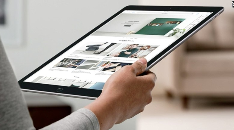
Apple’s iPad Pro is basically a souped-up iPad that nears laptop operating power and functionality. Starting at $799, it features a 12.9” (!) screen, allowing enough room to display two apps at once and truly multitask. Multitasking becomes even easier for customers that also purchase the newly unveiled Apple Pencil – a high-sensitivity stylus for $99.
Mobile users have long cited their devices’ small screens as a reason for turning to desktops to perform everyday tasks, from shopping online to ordering takeout. Apple’s unveiling of the iPad Pro shows they’ve got a pulse on consumer needs around mobile devices and are filling the gap accordingly. As PC sales are already on the decline and tablet sales have plateaued, it’s likely that hardware like the iPad Pro will jump-start another round of laptop cannibalization. Interesting product to launch though, as Apple’s MacBook sales are still steadily growing. The iPad Pro could steal share from the company’s own competitive product set.iPhone 6s and 6s Plus
The most interesting update to the iPhone 6s and its larger 6s Plus counterpart is the inclusion of 3D touch, tactile in-screen technology that sense fingertip pressure and gives touch feedback to users. Pretty nifty! The goal of 3D touch technology is to change the way users interact with multiple applications at once. For example, if you want a sneak peek at one piece of information within an app (ie. a location), you can simply hold pressure for a moment in App 1 to be given the preview you need in App 2, without going through all the load times (see image below). It reminds me of the “Quick Look” functionality for products on many e-commerce websites.
Why is this update critical to mobile experience design? It gets at the root of how we’re beginning to use our applications. We’re looking for succinct experiences that solve very specific needs, often using multiple apps to achieve one result. In addition to 3D touch, the new iPhones will also sport a 12MP back/5MP front camera, new metallic color options, and a welcomed payment plan to upgrade your smartphone annually.Apple TV upgrade
The new-and-improved Apple TV touts its own App Store, a retooled OS, and a multi-touch remote. Watching the demo actually made me reconsider my decision not to purchase one this year, as its interface navigation mirrors the native experience of Apple’s other mobile devices seamlessly. Add to that its integration with a Siri on steroids who can locate any TV episode (or part within), movie, or app with few hints to what you’re looking for. Never again will you have to search through Law and Order: SVU episodes for “that one guest starring Patricia Arquette.”
The remote itself has a glass touchpad on top, encouraging users to swipe through apps and entertainment icons for browsing and selection – just as you would on an iPad or iPhone. The mirrored functionality in navigation, as well as connected social TV apps from the likes of MLB, is the bridge needed to keep the TV alive within our homes. When faced with unlimited entertainment options on our in-palm devices, who wants to turn to an archaic TV and, most likely, fractured experience? Apple new TV box solves that problem.
Today’s event featured a few other updates too, like a reminder of Apple Watch’s upcoming OS2 launch and a new iPad mini, but those upgrades were inconsequential within the larger picture of Apple’s commitment to seamless mobile experience design. I was a bit disappointed to see such little unveiled in terms of Apple Watch upgrades though, as I believe Apple is just skimming the surface of what it could do for wearable experiences within our connected lives. My colleague and Circle Click CEO Anne Ward was also hoping for an “Apple Home” announcement today as a platform for our personal IoT, but alas, that too was missing.
For now though, it’s encouraging to see such a large hardware player like Apple pushing the industry forward in its approach to mobile-first experience design. I’m excited to see what brands will build on its foundation.


